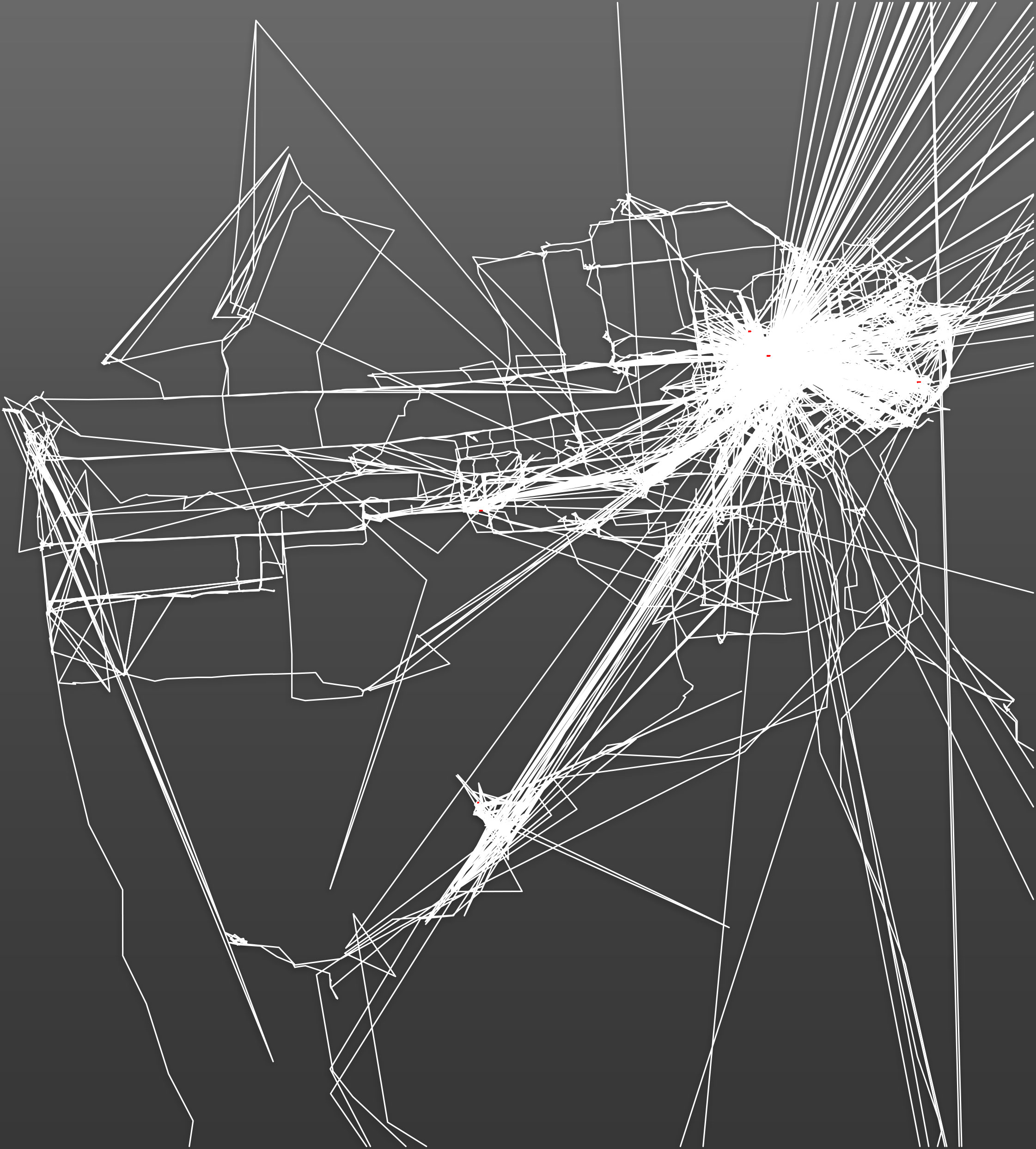
As you may know, your smartphone can track your location over time. I’ve had location tracking enabled continuously since 2012, because I think it’s interesting and what could possibly go wrong? The map revealed by location tracking is fascinating to me because it’s an inverse of the story we tell ourselves about ourselves– key moments vividly remembered, turning points, our tendency to condense and jump-cut our life so that it makes a coherent story.
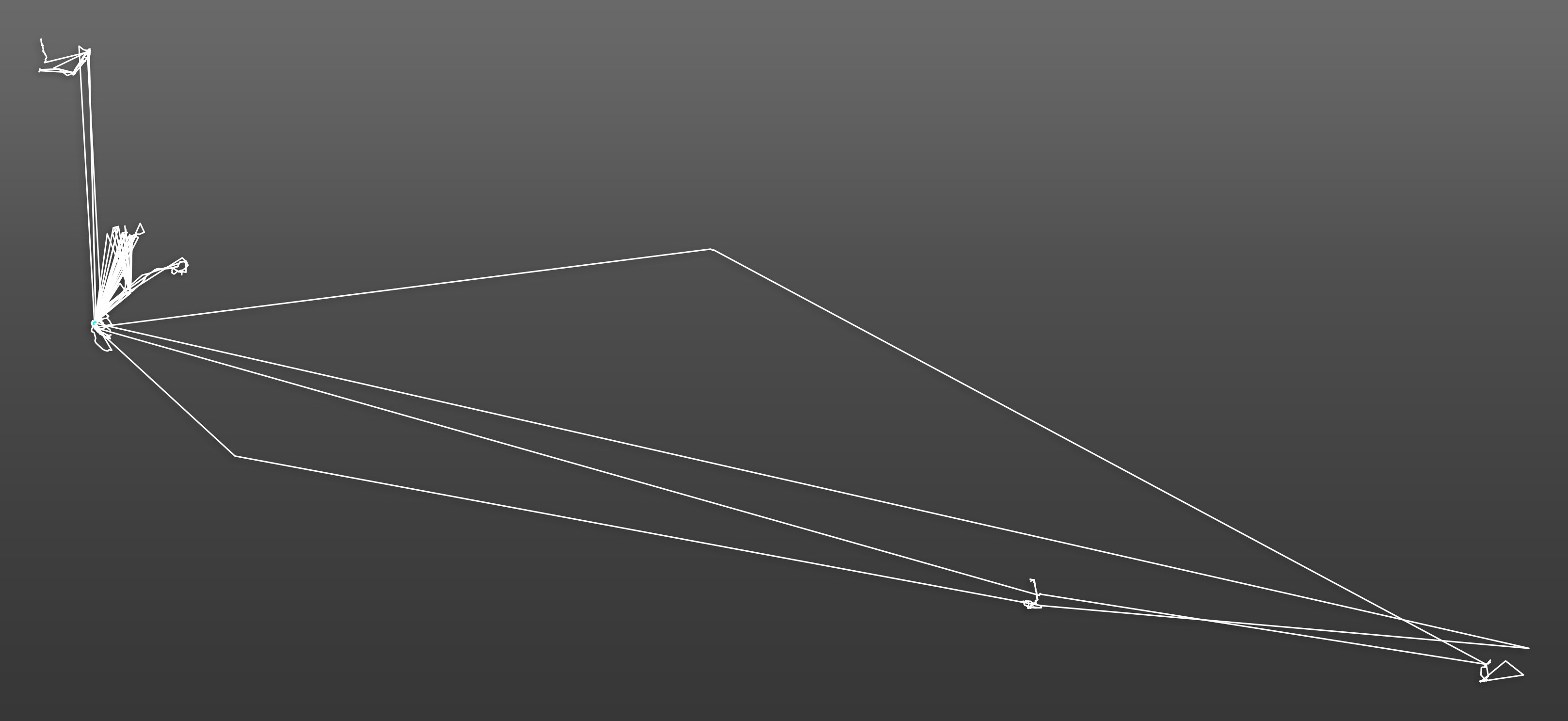
By contrast, in the time-based location tracking dutifully recorded by our phones, the greatest weight is given to the repeated actions, home-work-bar-home-work-bar. Also, I just like maps.
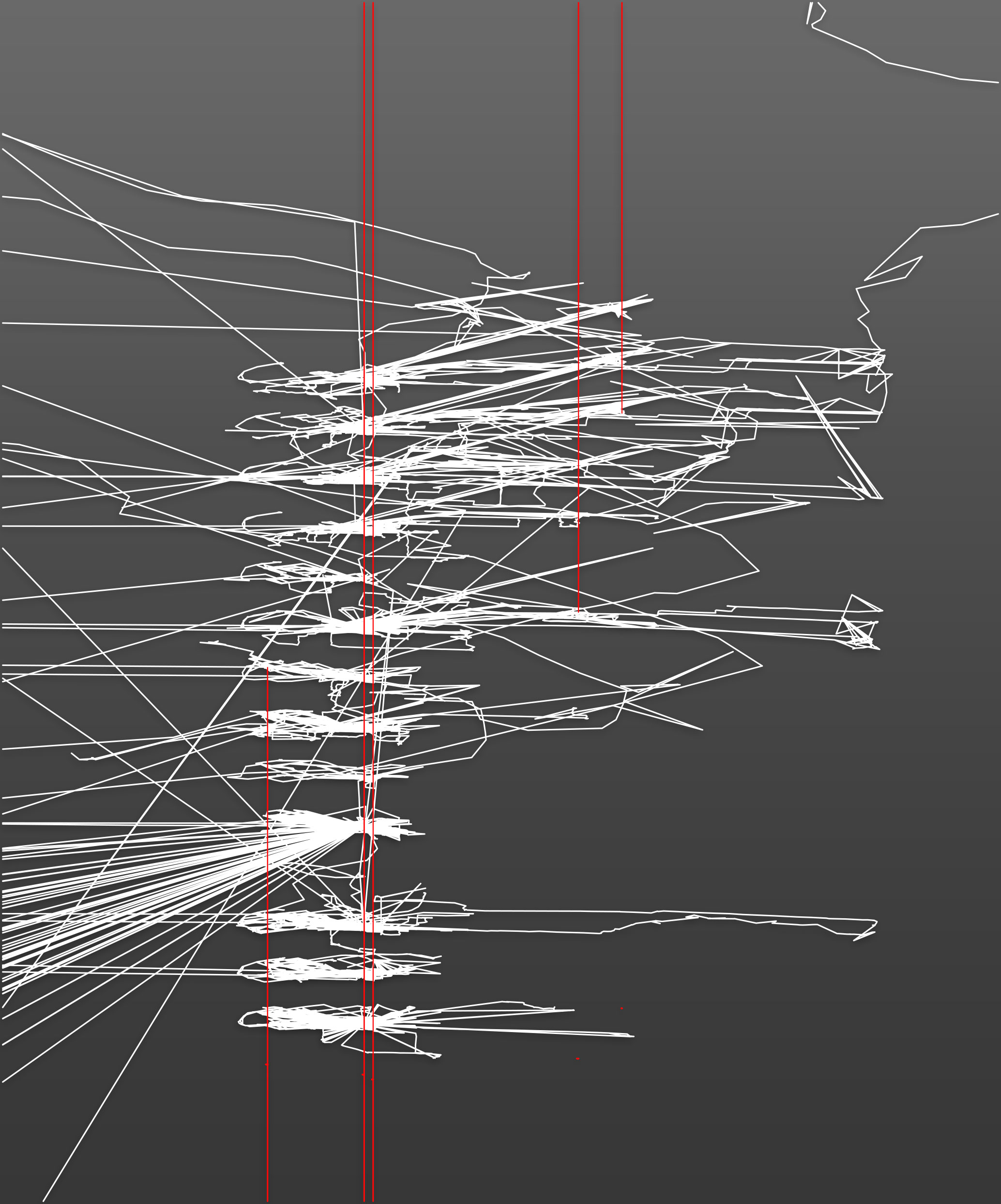
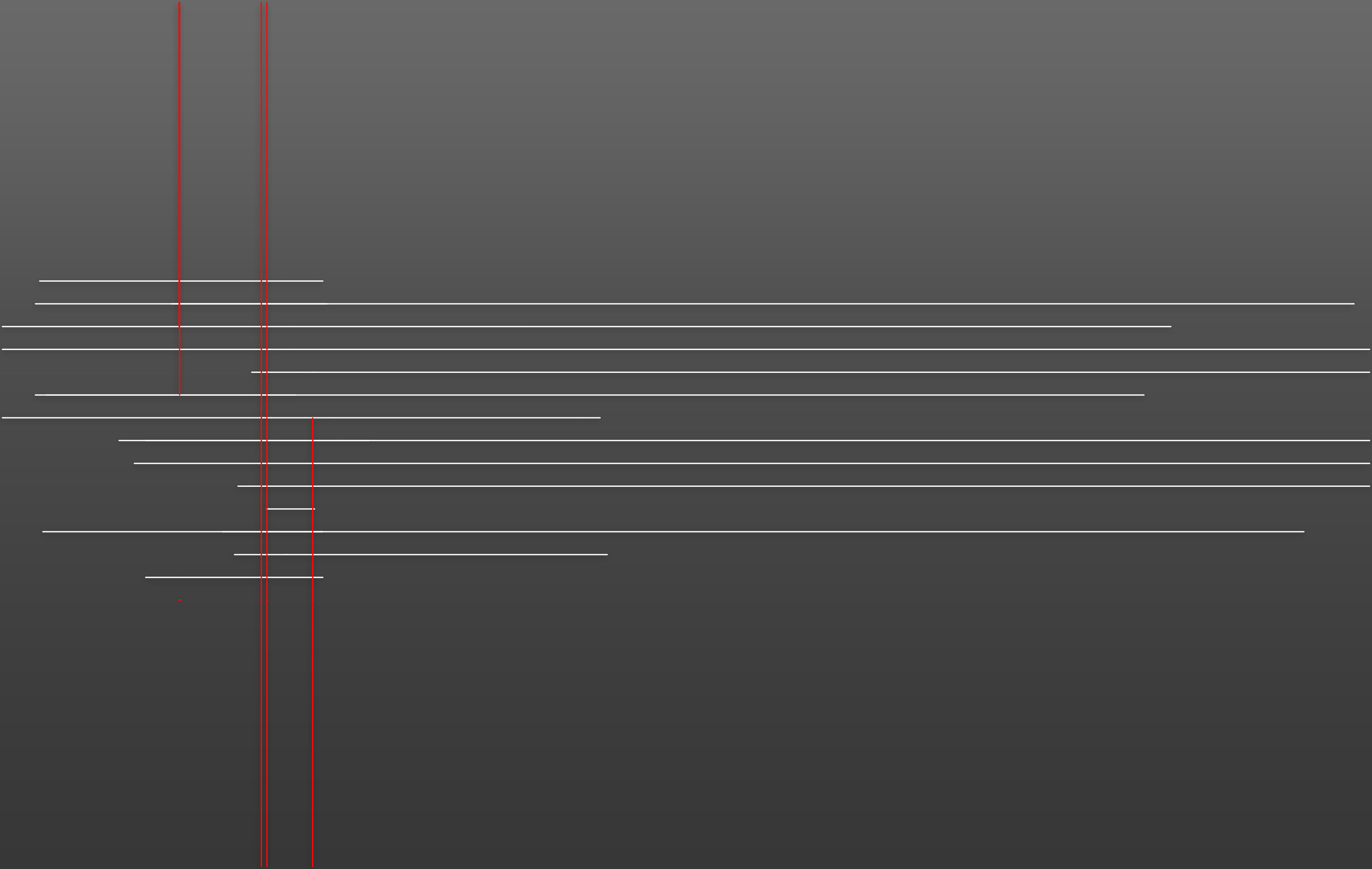
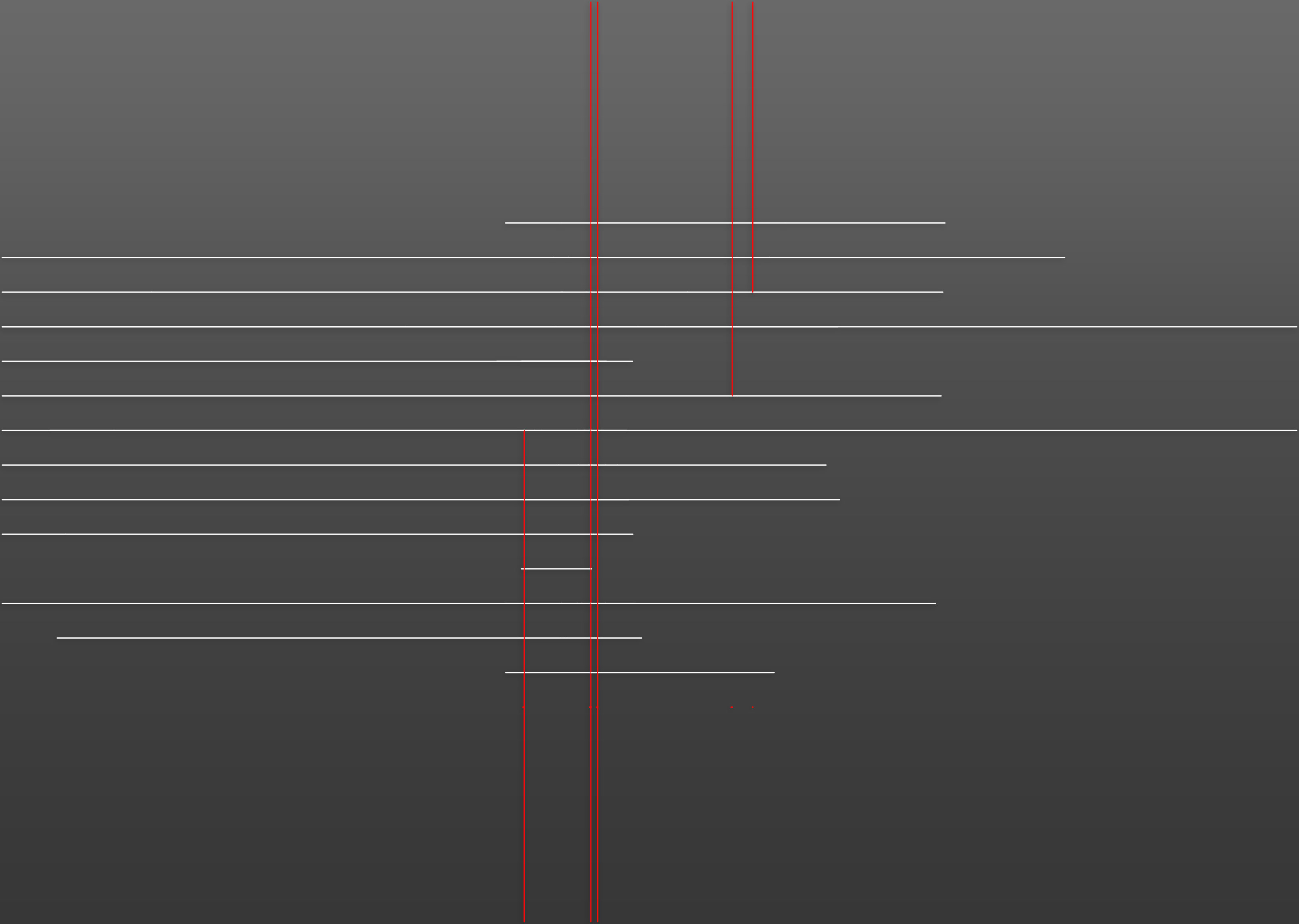
By exporting time slices of one month each, and then stacking them in the z-direction, I can see clusters appear and disappear. Over the course of this year I left a job and started a new relationship, and I’ve created vertical lines in red through the series.
The process
I generated all this by exporting my location history to Google Earth format (.kmz), then converted the KMZ file into AutoCAD. So it’s kind of a hack, but even as crude as this method is, I think it generates some interesting shapes and suggests some interesting ways to interact with the data we leave behind.
Thanks for reading, and if you have some ideas for better ways to manipulate this data or things you can do with it please drop me a line!