Update: This article was written early in the design process and the library underwent considerable development after it was written. I’ve since written a case study for the Journal of Green Building that includes lessons learned from the built project. You can find it here: West Berkeley Public Library: A Case Study in Zero-Net Energy Lighting Design.
If you were wondering what I do all day: Here’s a project that is still very much a work in progress, but the design process is kind of interesting so I though I’d post up where we’re at with it so far. West Berkeley Library is a planned Zero-Net branch library for which I am consulting on the lighting. The architects are Edward Dean and Michael Bulander of Harley Ellis Devereaux.
Zero-Net means that the building has sufficient power generation that it generates at least as much energy as it consumes. In this case, the building has photo-voltaic panels mounted on the roof that feed excess power back into the grid during the day, offsetting the amount of power consumed at night. This is environmentally preferable to a fully off-grid solution, as peak electric usage is typically during the hottest part of the day, and so that’s when power companies run their dirtiest and most inefficient plants.

An ounce of reduction is worth a pound of generation: In addition to on-site generation, Zero-Net facilities must implement cutting-edge strategies to minimize consumption. This is a practical necessity, as there is typically a limited amount of real estate available to give over to generation, and a cost cutting strategy, as it is much less expensive to reduce usage by a watt than to add a watt of generation. Efficiency strategies for lighting include:
- Extensive use of daylighting
- Dimming fixtures, which may be manually or automatically adjusted for less than peak load
- Efficient lamps and luminaires
- Occupancy sensors to turn off the lights when a space is unoccupied

Overall lighting strategy: Often lighting design for interior spaces involves lighting the entire space up to the highest level necessary for the task typically performed there. This approach, while having many virtues, is not particularly great from the standpoint of energy consumption.
After looking at a number of options, we settled on an approach known as ‘low ambient/task.’ In low ambient/task lighting, you instead light the space up to the minimum level necessary to get around without walking into walls (low ambient), and then put concentrated task light in the areas where you need the higher levels. As a designer, it’s kind of a pain to implement, because you have to think about all the tasks that will be performed in the space and make sure that you’re providing good lighting for all of them. However, done right you can achieve very low energy densities without sacrificing the quality of the lighting.

Task lighting is provided by indirect/direct floor lamps at the reading areas, which also serves the aesthetic goal of making these areas feel as like a personal reading area in your home, rather than an institutional study space. Task lighting on the stacks is provided by linear LED fixtures, about which more will be said later. The ambient lighting is provided by the uplight component of the floor lamps, each of which has two 55W biax lamps with about a 70% up/30% down distribution. The uplight component does not do much in the way of footcandles on the ground, but does make the space feel airy and open instead of cavelike, contributing to the perceived brightness.

A unified design aesthetic: The main room is divided into adult stacks and a reading area to the south, and children’s to the north. The approach to lighting in the two spaces was necessarily somewhat different, as the linear LED fixtures cannot be used on the lower stacks in the children’s areas, nor can floor lamps. However, an important requirement was that the two halves of the space not feel distinct from each other, but rather that the whole space feel unified. This is accomplished by placing an appropriate amount of direct/indirect fixtures in each area of the space so as to keep the lighting levels on the walls and ceiling consistent.
The skylight wells created a repeating dark-light-dark pattern, and that theme was used throughout to tie the space together.

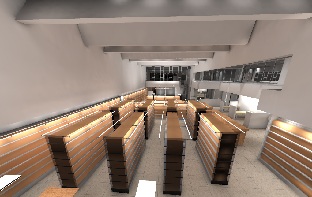
Stack lighting is a problem. Best practices for stack lighting, that is the lighting on the spines of the shelved books, is 30 fc average with a 5:1 max:min ratio between the brightest point and darkest point. That’s a very high average lighting level, and in addition a *very* difficult uniformity to achieve. Common approaches are to run a narrow beam fluorescent fixture down the middle between each row of stacks, or to put a small linear task light along each shelf.
We looked at these and other approaches, but the one that had the lowest lighting power density (LPD) and best performance was to put a linear LED fixture along the top of each stack and graze down the front of the shelves. This puts us at 23 fc average with an 8:1 max:min in this study, so with contributions from ambient light we’re right at the recommended levels. Power consumption is a fairly remarkable 5W per lineal foot of stack (10 for double sided stacks as shown here). Additionally, LEDS are easier to dim than fluorescent, so in our dawn-dusk scenario they could be run at less than full power.
 Exterior Lighting: Aesthetically, the goal is to create a lantern with the appearance of light streaming out from the interior. The desired feeling is one of approachability, that would welcome pedestrians inside, rather than the grandiose tradition of civic architecture that creates a space between the viewer and the architecture.
 Near the entrance, ingrade uplights wash the wall, while LED pinspots pick up repeat the dark-light-dark pattern of the interior on the overhead beams. The brightly lit foyer creates a focal point to attract the user into the space.
I’m working on daylight studies to analyze the actual projected energy usage now, hope to have that post up in a week or two. A big shout out to Edward Dean and Michael Bulander for for having both the vision to conceive of this project and the skills to realize it. Also, the inimitable Dal McGinnis, my colleague at Lighting Systems.