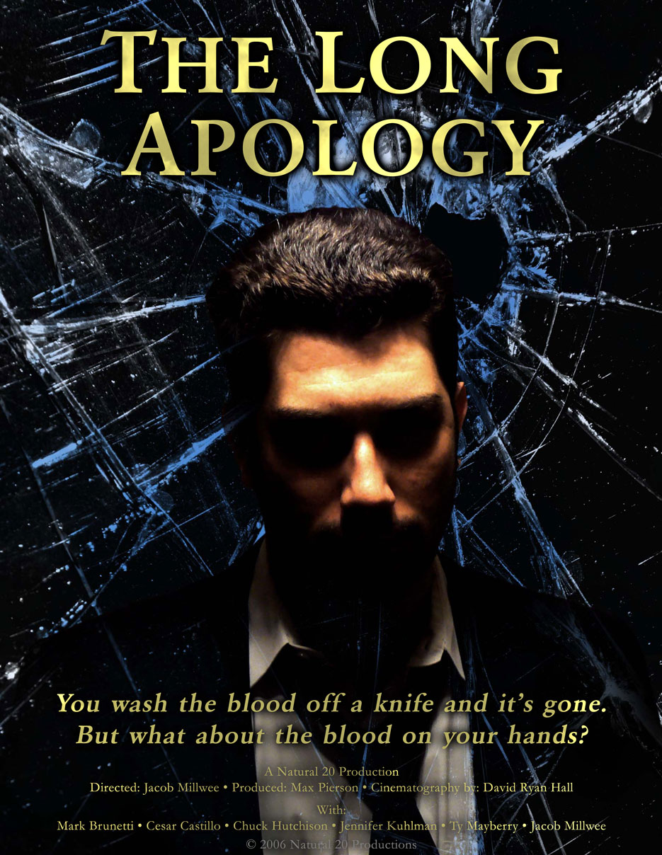
A Little While Ago, I produced a film with some friends of mine called The Long Apology. We’re nearing the end of post-production, and it’s time to start thinking about the DVD slipcase of the finished product. I’ve been tasked with designing it, because I’m currently an unemployed layabout, whereas my friend and business partner Ryan, who actually designs these things for a living, has distractions like a job, dog, social life, &c.
We have some artwork I did as part of the marketing package for the film, and if we used that the front cover would look something like the above. I put it together in about a day, so it’ll need some work, but it’s nice to have something to start from.
I wanted to see what the current state of the Art was, so I went down to Blockbuster with my digital camera, and took pictures of all the DVD slipcase backs I liked. Which seemed to make the sales clerks nervous for some reason, but they left me alone. One of the advantages of living in a city like Portland, with its abundance of weirdos that are only to willing to share their theories about Transcendental Meditation or whatever.
Strangely, it seems like the people that design these things are just phoning it in by the time they get to the back. There’s a very consistent format, and very few of them show even a modicum of design intent. The big budget movies actually had the least interesting backs, strangely. I probably looked at over a hundred of them, and there were only a few that were worthwhile. Here’s a pretty typical example:
 We have the following elements:
- A tagline
- A synopsis
- A barcode in the upper right
- DVD special features
- A larger still from the film, integrated into the layout and background
- smaller stills in some kind of framing device
- Credits
- A bunch of icons corresponding to the format and such
Here are some examples that were interesting in one way or another:


I don’t know who does the promo artwork for Terminator: The Sarah Connor Chronicles, but it’s riveting. Maybe not so useful for a DVD back, though, because it relies so much on simplicity.

I’m going to watch the film again, and then fire up Photoshop and see what I come up with.